

Ford Hallam
-
Posts
3,091 -
Joined
-
Days Won
78
Content Type
Profiles
Forums
Events
Store
Downloads
Gallery
Everything posted by Ford Hallam
-
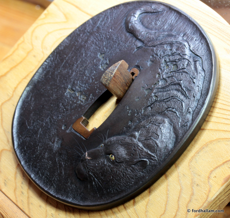
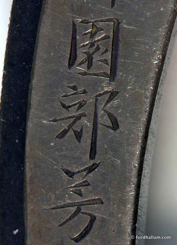
For those of you who don't Instagram or facebook here are a few images of a piece I recently completed. It's a commission thus signed on the reverse. Not exactly classical Edo period in style the composition is loosely based on a contemporary Chinese ink painting. It's made of 120 year old finely wrought iron, the eyes are yellow gold and shakudo and the nose is pink gold. Pink gold only entered the Japanese metalworking tradition, presumably from Europe, around 1910-1915, so it's not see in tosogu but is often seen in Meiji period export objets d'art.

- 26 replies
-
- 14
-

-
The 1985 Tokyo National Museum exhibition, and catalogue 1987, "Uchigatana-goshirae" might be worth examining for evidence of what early Edo, and earlier, menuki placements might have been. From a quick browse though I'd suggest that the usual placement we see today, ie: under the finger tips, was most common even back then. Thare are a number of tsuka illustrated that look pretty ancient and to have seen campaign use. Where there are menuki present, not always the case, they are in the usual position. I think there is an unfortunate modern tendency to insist that everything on the sword has a functional reason for being there and while this may have some basis in terms of thing's origins true functionality is easily forgotten. The earliest hilt ornaments we might equate with menuki are 'tawara-byo'. There are the little gilt 'rice straw bales' that act as rivets to secure the same in place on kazari-tachi koshirae. In my opinion menuki evolved from these and I think attempts to try to imply a purely functional reason for them (menuki) being on the sword might miss the reality that they more likely had votive or talismanic meaning and/or were to an extent fashion/status signifiers.
-
I just want to make a few comments regarding brass tsuba. Firstly it's important to note that shinchu (the Japanese term for brass) and sentoku are not the same thing. Shinchu can be forged and is malleable whereas sentoku is not workable in that way. Sentoku is a casting alloy and will break if any forging or hammering is attempted on it. Shinchu is an alloy of copper and zinc, with zinc typically being in the 12 to 35% range. Traces of lead are inevitably present, generally less than 1%. Sentoku is a more complex alloy that is typically Copper with zinc 10 to 15%, tin 5 to 8% and lead 6 to 8%. Other traces elements are present also. And although two generations of Mitsuhiros made tsuba featuring 100 monkeys, horses and the like which bear inscriptions describing the metal as sentokukin/gane this alloy is in fact quite different. These are actually shinchu with a little arsenic in the mix. Sentoku as we understand it today only entered the Japanese metalworking tradition in the Meiji period. It wasn't used for tosugu previously. Now to the patina. The essential componant of patina on traditionally patinated non-ferrous tosogu is cuprite. This is a red copper oxide. It follows then that copper patinates naturally to various shades of red, the red cuprite colour being modified by traces of other oxides in the patina as a result of other elements in the alloy or by means of cunning alterations to the basic patination mixture, temperature and speed/time of the patination process. Brass patina owe their yellowish/ochre tint to the presence of white zinc oxide in the patina layer. Because zinc is more reactive than copper we frequently find that the surface of previously patinated antique brass pieces are zinc depleted. This means that when a new patina develops it will be quite different to what it was originally and often much darker and copper-like. The point being that while copper alloys like brass may indeed develop a decent patina over time the new colour will almost certainly be different from what the maker planned. The recovery of original and authentic patina is not always possible but there are processes that can be used that compensate for the zinc losses. This is a close up of an early Edo period tsuba (Higo) showing the results of surface de-zincification. The structure that is revealed is called dendritic and is essentially copper rich (with a little zinc trapped in it). The missing part was zinc rich. Zinc has a much lower melting point than copper so as the alloy cools the zinc rich parts are squeezed in to the gaps of the cooling copper network/dendrites. In this example the result of the zinc loss is very clear in areas that are protected from fingers but on more exposed areas that metal has been 'polished' smooth again by years of handling.
-

Something To Celebrate The Year Of The Rooster, Lots Of Images!
Ford Hallam replied to Ford Hallam's topic in Tosogu
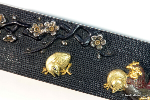
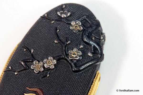
Pete, I wasn't there when it was made I was merely suggesting that was what was done based on what I could see. "From the look of the sharpness of the punch strikes I'd suggest that the metal was stamped into a pre-carved negative die." The flowers are inlaid in silver so no need to bump up volume for them. The raised metal was to create the branches. "... pre-punching of the fuchi band (while still in its flat state) to create the volume on the front from which the branches were carved." -
another one. http://page9.auctions.yahoo.co.jp/jp/auction/k233330170 The maker's family name is Takada.
-
Sorry Gents, missed this one earlier...busy start to the year. The patina does look a little thin or perhaps fiddled with. Certainly not at 'full strength' but not a big issue to rectify in this case. Similarly the gilding is a little tired in places and might benefit from a little bit of help.
-
Something To Celebrate The Year Of The Rooster, Lots Of Images!
Ford Hallam replied to Ford Hallam's topic in Tosogu
Brian, actually not all that common in the Edo period but sometimes seen on better/earlier Mino work. The most usual approach was straightforward inlay. -
Something To Celebrate The Year Of The Rooster, Lots Of Images!
Ford Hallam posted a topic in Tosogu
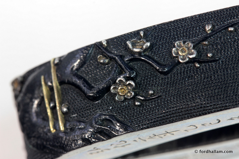
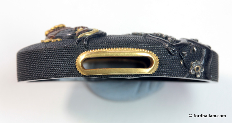
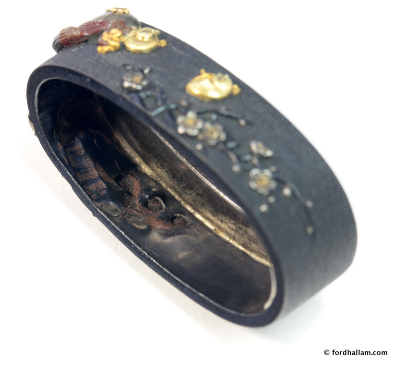
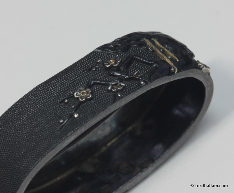
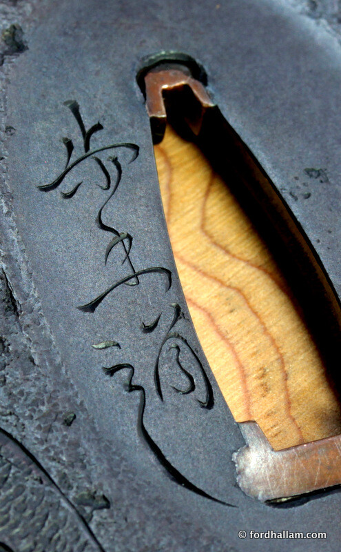
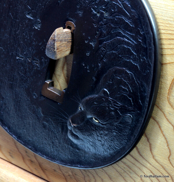
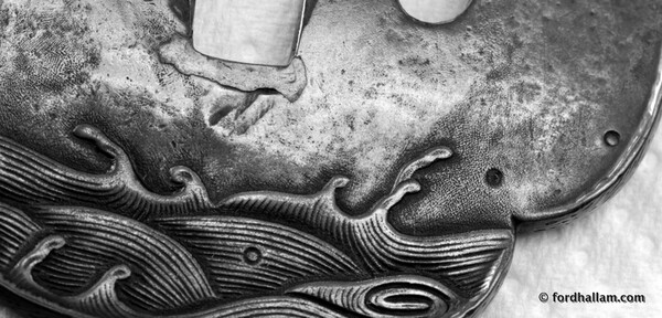
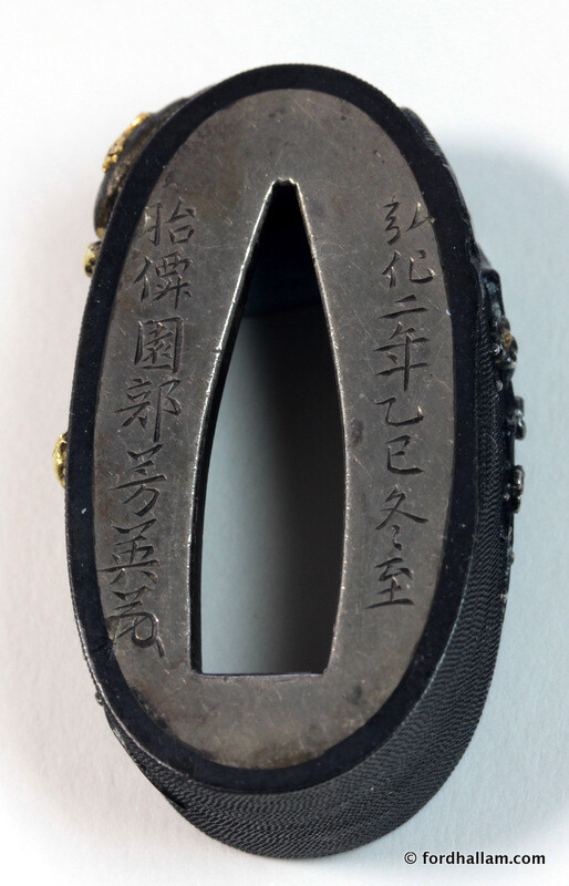
I took a moment this morning to take some study images of this set and thought I'd share them here. It helps to have a good macro lens and tripod. :-) While not exactly a rare technique it's interesting to note the use of pre-punching of the fuchi band (while still in its flat state) to create the volume on the front from which the branches were carved. From the look of the sharpness of the punch strikes I'd suggest that the metal was stamped into a pre-carved negative die. Click on the images to see bigger versions.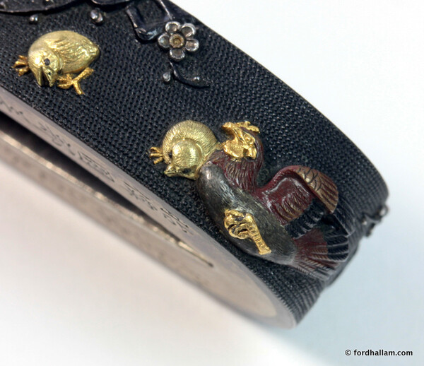


-
from the description of the linked to Yagyu tsuba; "...very high skill is necessary to leave these lines visible and not too open or closed." I would have to disagree with this claim. In fact it's not at all particularly complicated to forge wrought iron (which is what these things are made of) in a very regular and even layered way. In fact when I've made my own material I've had to go to extra lengths to distort the layers lest it end up looking too boring and regular. As for revealing the actual layers that is merely a consequence of the oxidisation of the iron surface when it was last in the forge. Iron of varying compositions will oxidise at different rates thus revealing the sort of texture we see on this mimi once that oxide layer (fire scale) is removed by means of a mild acid pickle. This would all be done before the final patination processes. I'm not making these observation simple to be argumentative though. I merely think that if a piece is going to be evaluated on the basis of visible workmanship then that workmanship should be correctly understood.
-
I've just posted an update on the book project if anyone is interested. https://www.kickstarter.com/projects/525883510/Japanese-metalwork-technique-by-ford-hallam/posts/1651191 And if you'd like to be notified when we start taking pre-orders for the book (if you missed the Kickstarter Campaign) please sign up for news updates on my website. Thank you.
-
Is it possible this seal was added later? It's a completely different colour of gold for starters, a different alloy composition, to the gold used everywhere on the tsuba. The gold on the leaves and elsewhere was applied by means of the nunome zogan technique and from what I can see where the cross hatched ground that wasn't eventually covered with gold the texture has been worked smooth. On the seal, though, despite the ground being flat and therefore making finishing much easier, the coarse hatching of the ground is still very clear. And to my eyes the seal is just too closely squeezed up against the last kanji of the mei due to there being no more room below.
-
the positive elements/space of the design is how it would be described in graphic design terms.
-
In Brian's example I'd call those parts ribs.
-
In my opinion the infills are unlikely to be sahari/sawari as that alloy is simply far too brittle allow for any sort of deformation and punch work decoration. In fact it's so brittle that it can be broken up by hammering on it and then further ground to a fine powder in a simple pestle and mortar. It's in that form that it is used like enamel powder and melted in to prepared cavities like on Hazama tsuba. It's possible the infills are a variety of Japanese pewter. Typical compositions are in the region of 80% tin and 20% lead.
-
"Ford, I definitely take your point regarding the impact of "Sensei-ism" in Japanese culture, but consensus on the greatness of certain artists and/or works is not limited to Japan, of course, so the phenomenon of Sensei-ism can't explain it completely. How is it that so many agree that Hon'ami Koetsu's "Fuji-san" chawan is among the greatest ceramic works in history? I mean, there have been millions of tea bowls made; why does that one, particularly, rise to the top? Of course, we could go straight to Leonardo's Mona Lisa here, too. Among tsuba, what exactly accounts for Kaneie and Nobuiye having been "recognized" as the two greatest names in tsuba? Why those two? Why not three, or four? Or only one? In other words, precisely what separates those two names from all the rest? " Hi Steve well it's interesting, the Fuji-san tea bowl is a perfect example of a work 'recognised' by a foundational connoisseur as being excellent. The other, most celebrated and 'recognised' earlier, example being the Kizaemon tea bowl. I first encountered that piece in Soetsu Yanagi's 'The Unknown Craftsman' over 30 years ago. I would have to confess that its raw and unpretentious aesthetic and accompanying philosophy was 'right up my street' so to speak. I was a devotee before I ever knew of that sort of aesthetic and philosophy. And while that is all very much a part of what makes me tick even today I now have a somewhat less zealot-like adherence to that orthodoxy. Personally speaking I do 'see' and am always reaching for more in works like the Fuji-San and the Kizaemon but I have doubts about proclaiming this particular expression as supreme. There's simply too much other stuff humans value and find meaningful to insist on a ranking system. The Mona Lisa is self evidently magnificent, but I would argue it is only one such artistic work of excellence among many others and many others that are quite different in all respects. So where does this leave us? My own view is one of a multitude of incredible artists each of whom deserves to be carefully and sensitively seen in their own context. The Nobuie factory ( I refute any notion of 1st and 2nd masters or even 'sole authorship' here) produced some works in iron that today that , perhaps partly due the effects of age, and possibly in part a shift in aesthetic appreciation at some point in the past (were they 'discovered' by tsuba connoisseurs, informed by Sen no Rikyu's teachings, long after they were made, like anonymous Korean rice bowls became national treasures as tea bowls?) we now regard as 'the best' in iron tsuba'. The house of Goto, unquestioned as absolutely top notch. But in reality absolutely intent on maintaining an unchanging political expression, in art, that had as its primary function the framing of the Tokugawa Shounate as similarly unchanging and reliable. The Louis Vuitton of the Edo period. Mitsuoki Otsuki, his greatest artistic achievement, attested to in his own statement inscribed on the reverse, is not even in Japan (it's in Boston)....nor is it even referenced in contemporary Japanese tosogu literature. And this unique aesthetic thread of his, the birth of which which is clear in his other works, is not yet even being discussed by those who claim to be the authorities and passing judgement. There exists a tsuba by Tanaka Kiyotoshi with an inscription with a similar sentiment that is also not part of the evaluation of the great masterpieces of the past in this field. That one is in the V&A in London. Kiyotoshi is rightfully recognised as a great master and artist..but has his own personal and most intimate judgement been considered? it's there, on an unpublished and ignored tsuba in London. Kano Natsuo, easily accepted as one of the greats ( a friend of Kiyotoshi) and often called the last great master, was himself an artist in continual evolution. He was very obviously of the Otsuki school and grew out of the aesthetic explorations of his predecessors in that group. Matsuo Gassan being the most obvious to my eyes but Otsuki's touch with a kata-kiri cjisel is also blatant in Natsuo's own work. Yes, Natsuo was a proper master....but there is only a small group of work, in a very particular and unique style that for me makes him exceptional. It's that small body of work, the culmination of his development as an artist, that is what he ought to be correctly recognised for. How would that appraisal be reflected accurately in a simple list? Pete mentioned Unno Shomin, and quite rightly too. Too late to the party to be generally acknowledged as a tosugo master despite actually leaving us a fairly significant body of tosogu work. I love Unno Shomin, he was the epitome of Mito precision and delicacy. I've had the privilege of working on at least 6 Meiji period works by him and while his technical skill is so refined as to almost leave you feeling it's art he is, in my opinion, more the technician than an artist. In that respect Natsuo edges ahead...and Otsuki chugs back another cup of sake and smiles knowingly. All this to say, simplistic ranking lists of all of the artists of the past who's work we all enjoy and appreciate will only serve to obscure a more meaningful understanding of the art form and the society and culture that gave birth to them. t
-
but are the technical degrees of skill really being assessed? ...and if so how confident can we be without knowing the actual technical understanding of the craft of those making the judgements? On what basis of training or understanding are these supposed skill judgements being made? Can anyone without actual 'hands on' experience judge skill levels in the wide variety of techniques we see in Edo period tosogu? Who can really say what a metal is merely from it's colour? ( I would hesitate and I have 10000's of analyses to work from) ..or decide that katakiri or nanako in iron is more skilful than the same technique in shibuichi or shakudo. But, even if the judges were qualified to judge skill and technique (and I absolutely refute this notion) that merely reduces the whole exercise to a technical one. So art and aesthetic are not part of that judgement.
-
Franco while I get the gist of your comment I would suggest that objectivity is not involved in that case at all. As far as consensus and agreement go, in Japanese society, it really cannot be taken at face value I fear. In my experience the most senior and most respected 'authority' is generally followed. It's the single most awkward issue in Japanese academia. It's a social faux pas to disagree with 'Sensei'. But if we are to accept your premise then according to "overwhelming consensus and agreement" the best music in America, according to actual sales, is firstly Heavy Metal followed by Country and Western.
-
I think the very idea of ranking artists in some sort of hierarchy table can only ever be subjective and personal. Add to that the impossibility of judging very different styles and aesthetics against each other and the whole thing begins to look a little bit like a fantasy football league :-) Can anyone imagine a serious art historian drawing up a similar 'league table' of European artists of the past 700 years?
-
I'm with Brian on this one. In fact, you provided the evidence very clearly in you own words, John. :-) The most obvious and easily understood (by the layman) bit of evidence is this; There you have it. It did have a patina. Magnetite is a major component of ferrous tsuba patina. That is came away on a toothpick is a clear indicator that the original patina was stripped using a mild acid or de-oxidising solution. Bands of rust...ergo; not likely rust resistant or stainless. And the banding points to a layered structure consistent with folding. I would add that the sort of iron used for these types of tsuba was essentially a very finely worked 'wrought iron'. One of the interesting and useful features of this material is it's inherent corrosion resistance compared to a more homogeneous mild steel or simple carbon steel. This is generally understood to be a consequence of minute fibrous traces of silica and slag that inhibits the usual action of iron being converted to iron oxides, rust.
-
Hi Luca, it will be a limited print run in the first instance but I do intend to print more than the 500 for my backers. We'll probably advertise pre-order options when we go to print. I'll post an announcement here on the NMB at that time or, to make sure not to miss out, you could sign up for news updates on my website. If you don't have my book everything you think you know about shakudo, shibuichi and yamagane will be wrong and the rest thoroughly stirred and filtered for good measure. How's that for a sales advert? www.fordhallam.com
-
a more pronounced dragon....D R AAA GG OOO NN E.
-
Hi Peter, you're in my backer report so you're definitely on board. Thank you. :-)
-
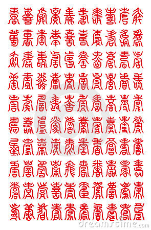
The design is comprised of 'lucky charm' characters. There is no specific motto or phrase as such. For example there are over 100 variant seal script characters for 'fu' good fortune. You can spot a few that are on this fuchi kashira set in the chart below. Also common are the characters for wealth, prosperity and longevity. In fact I'm pretty certain the oval shaped one on the end of the fuchi is 'longevity and health'. There a fuchi/kashira set by Sano Naoteru with a similar design illustrated in Lethal Elegance. pp. 117.
-
Probably around £100. Most of the cost will be down to the colour printing and the paper we want to use. We're using one of the finest art printers in Europe.
-
Aiming to have it all done and dusted by June.