
rkg
-
Posts
835 -
Joined
-
Last visited
-
Days Won
7
Content Type
Profiles
Forums
Events
Store
Downloads
Gallery
Everything posted by rkg
-
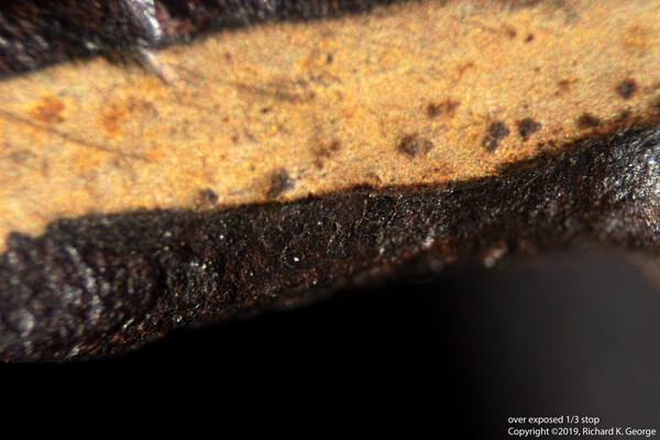
It kind of looks like maybe the piece was lacquered at some point? The surface of the tsuba shown in the image next to the bottom kind of looks like lacquer that is partially worn away. Other options are more nefarious - it could be some patination work was done on it (does it smell of selenium salts?) - It could also be wax - You might also try taking a q-tip with alcohol on it to the edge of the mimi and see if somebody brown/black waxed it - though YMMV on that - it could be that was done by the maker, so.... Best, rkg (Richard George)
-
Its that time of year..... Closet Cleaning sale... part 4
rkg replied to rkg's topic in Sold Archive
Sold. Brian, you can move this to the sold archive if you want. Best, rkg (Richard George) -
Brian, yeah, its mine. It was Grey's site, and I couldn't resist... Best, rkg (Richard George)
-
Its that time of year..... Closet Cleaning sale... part 4
rkg replied to rkg's topic in Sold Archive
Piece is on hold, but the Aizu shoami piece I listed earlier is still available: http://www.militaria.co.za/nmb/topic/28853-its-that-time-of-year-closet-cleaning-sale-part-2/ Thanks for the interest, Best, rkg (Richard George) -
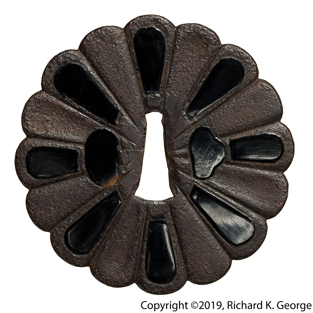
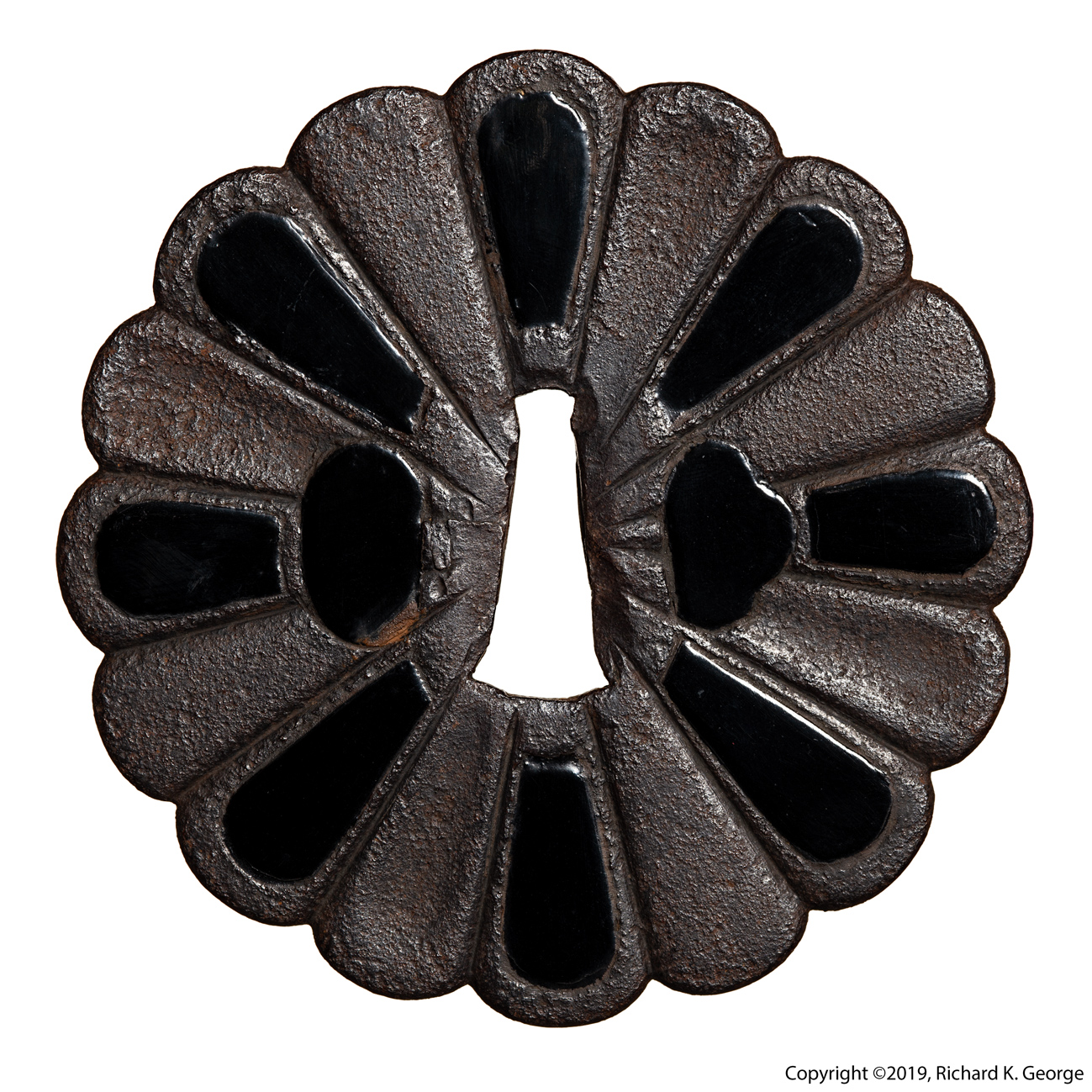
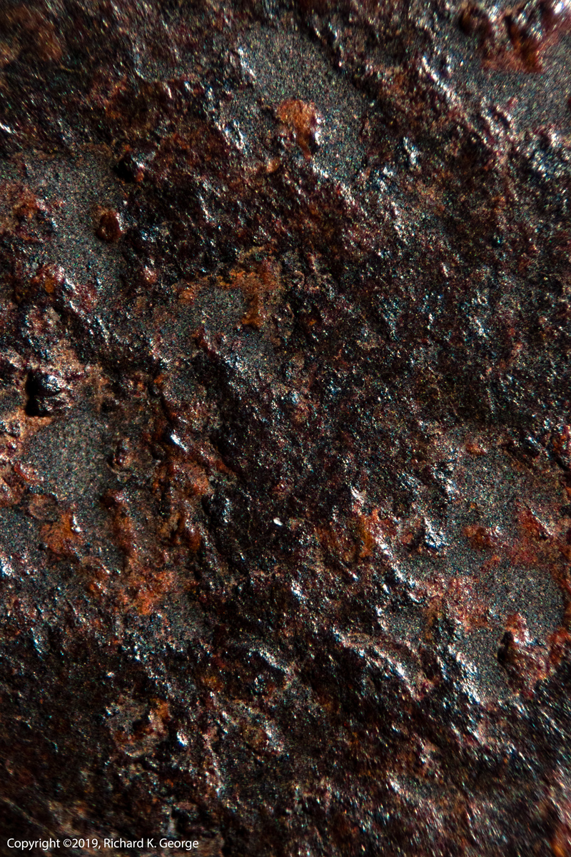
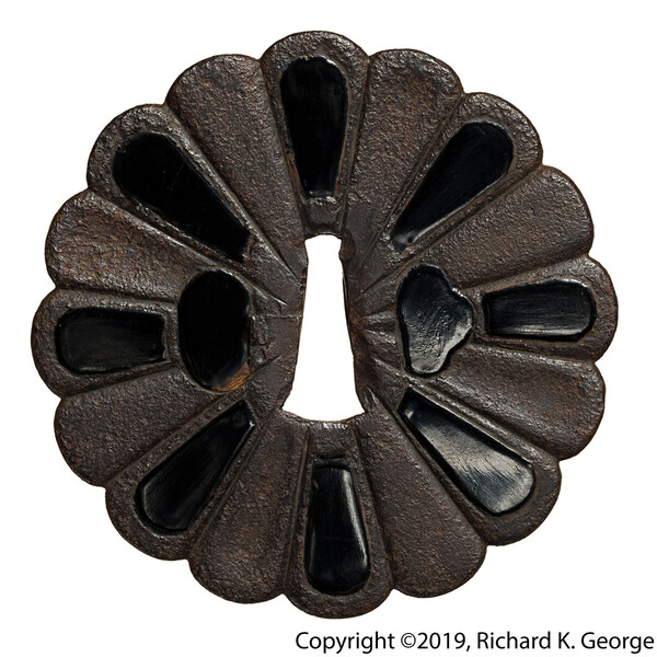
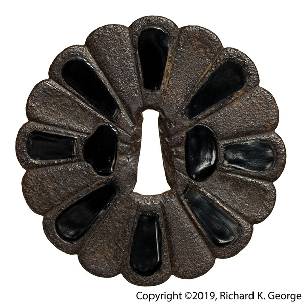
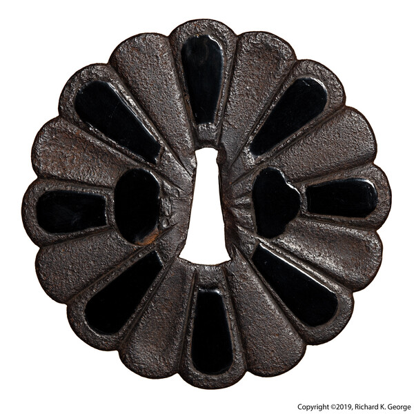
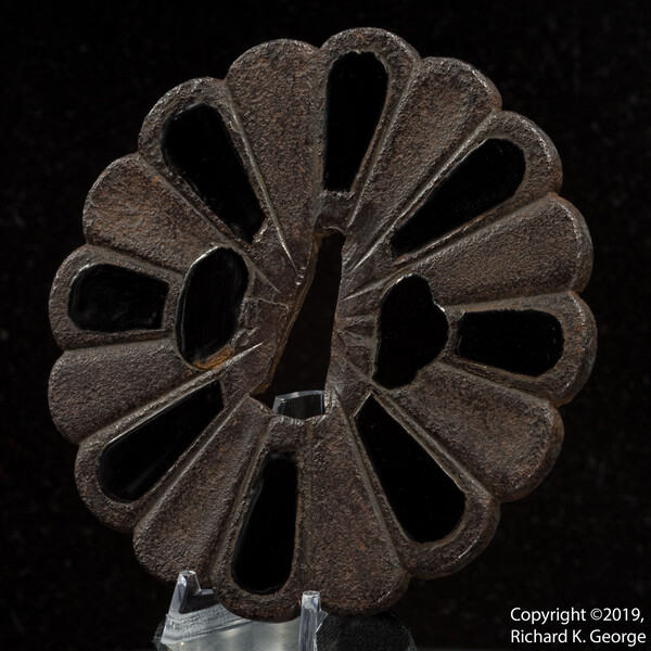
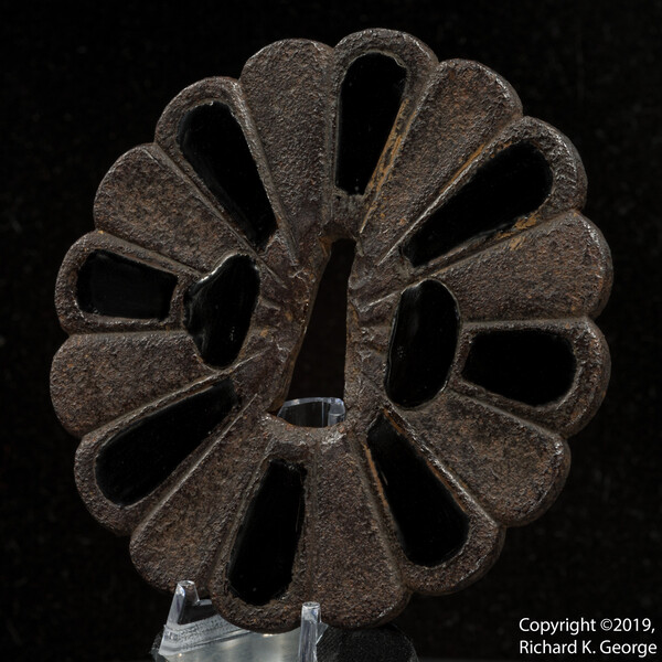
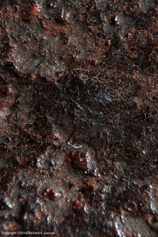
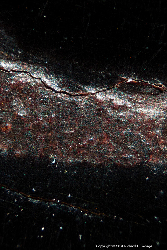
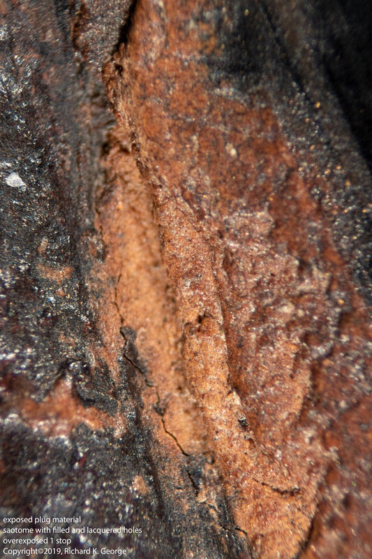
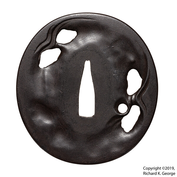
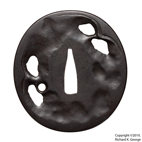
Lacquered Saotome tsuba This kiku gata is made of iron and measures 91.9 mm(both height and width) X 4.83mm (T,max) and it weighs 139.6g. Here's a link to front view of the tsuba with a scale in it: http://www.rkgphotos.com/sale_stuff/sale_stuff_2019_5/lacquered_kiku_saotome/glass_kiku_saotome_scale.jpg I strongly believe this is Saotome work due to the iron (you can clearly see weld lines where the place was folded inside of the nakago ana) and the sophistication of the design. The petals have three different “textures” – convex, concave, and a sukashi which alternate in a clever manner, which would create visual motion as the piece moved in the light – the Saotome made a lot of pieces that exhibited this design characteristic. The original surface has a fair amount of old lacquer on it - you can see that its pretty old from the crazing and how its been partially "eaten" by the patina. It can also be seen that there has been clear wax applied to the piece as well. I would date the base piece to the Momoyama period or earlier based on the construction (saotome design, folded iron) as well as the condition of the lacquer on the surface. The piece originally had sukashi and kozuka/kogai hitsu which have been filled and then lacquered. From the surface of this new(ish) black lacquer used to cover the filled areas and the few areas where the filler is visible, I believe this modification was done much later - in the Edo or possibly even Meiji period. The filler is interesting – I don’t know what it is, but I’ve seen it before used to build up mimis (I just got to study an example of this recently), as a coating on the outside of some nerikawa tsuba, etc. The piece comes with a sad box - one of the sides is broken loose and is currently retained with a rubber band. In additon, the inner lip is missing a piece as well has being damaged a couple of places) It is up to the buyer to decide if they want to bother having me ship it to them. And... I'm out of space again, Here are some links to images of the box/tsuba: http://www.rkgphotos.com/sale_stuff/sale_stuff_2019_5/lacquered_kiku_saotome/glass_kiku_box1.jpg http://www.rkgphotos.com/sale_stuff/sale_stuff_2019_5/lacquered_kiku_saotome/glass_kiku_box2.jpg you can see the microscope images in my original posting on this piece here on the NMB: http://www.militaria.co.za/nmb/topic/27675-another-bought-on-a-lark-tsuba/?fbclid=IwAR2ChOu_hTkCynz4IHAIFVPK-z9sxdYt1tAg2CL0lYFyHnGST3h5k9f-Nzo And here are some additional microscope images of the piece are on the kodogu no sekai facebook page: https://www.facebook.com/permalink.php?story_fbid=2191207904267879&id=266005023454853&__xts__[0]=68.ARAbbVbFq3Dhx_ez3mLmQw7dPvETeXXRRWlF1LVSk00tn16c9VeB5sBn7Tw5poYrgL4LsEfWa_7AMfGGgNDzzcq6mL2pbvJpQkyZ4R5Gdx6pyfrK2qayB-ZY7yY__OGS_2_fBym2RBpnGz2zCeA_-rh5Ahlks4FU6k_fWGu65X2s1ff17U7ciQKkdxZThZR31A67eOj_U1VWpOiA3Y0FX2-aqcJsmMGuHObwGDVkdcu59pDhnjeRkpXVoNrNRgI4Tx42y9N1MdJhiBkGi3g08komakUx7npHGZTgRdF6WAVv_yy7y0tTNpqLlrh54gso1S3O1tTQygfC0nRVYHjgJG1rtw&__tn__=-R Please see the full size images for additional micro photographs. Here are some 360 degree images of the piece. As usual, click and drag (or touch and drag) right and left to rotate the piece right and left: http://www.rkgphotos.com/sale_stuff/sale_stuff_2019_5/lacquered_kiku_saotome/360/glass_kiku_front/glass_kiku_front.html http://www.rkgphotos.com/sale_stuff/sale_stuff_2019_5/lacquered_kiku_saotome/360/glass_kiku_back/glass_kiku_back.html And finally, here's a link to a web directory with some full size images of the piece, micro photographs of the surface, etc. http://www.rkgphotos.com/sale_stuff/sale_stuff_2019_5/lacquered_kiku_saotome/ Please look at all the images carefully before buying. The price is in USD, and does not include shipping, which will be at actual cost. Thanks again for looking, Best, rkg (Richard George)

-
Robert, After consulting with several people, I think its a ghost (yurei) theme. Its not what I normally collect, but it was so sculptural.... Best, rkg (Richard George)
-
Here's one piece I got not tooo long ago where the hada is subtle: Best, rkg (Richard George)
-
Elliott has the remaining new stock of the Haynes Indexes of Japanese sword fittings and associated artists sets, and Grey also has a copy: http://www.japaneseswordbooksandtsuba.com/store/books/b760-index-Japanese-sword-fittings-and-associated-artists-robert-haynes Just remember to also grab the two addendum books (as Grey had duly noted in his description). Best, rkg (Richard George)
-
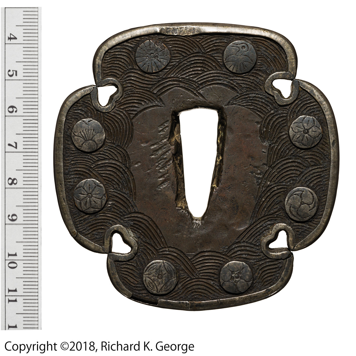
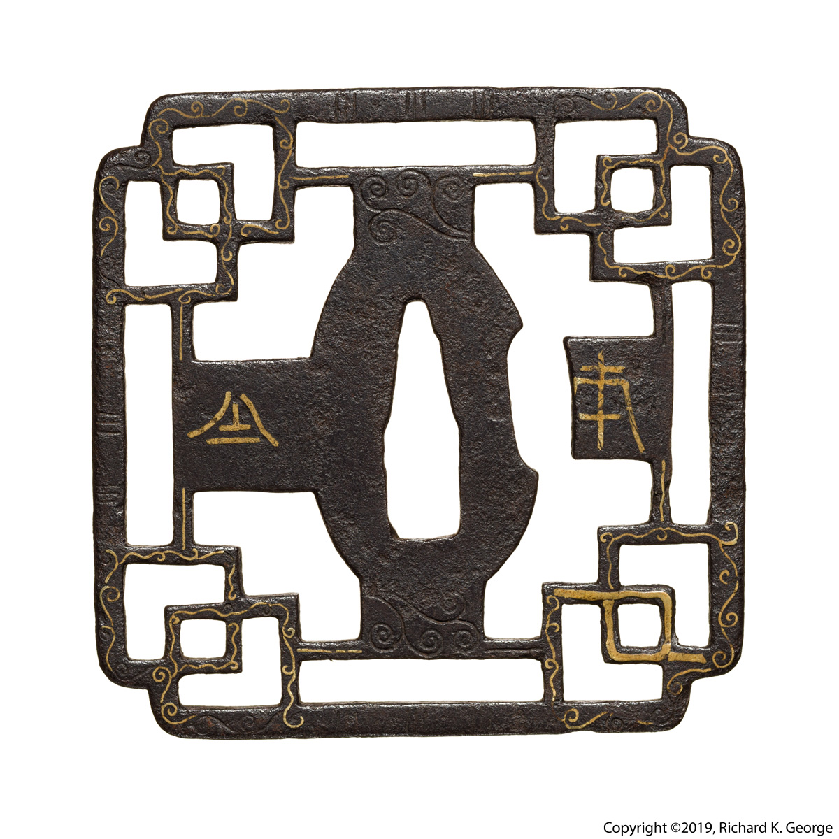
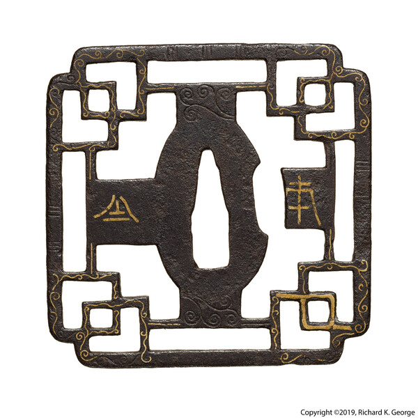
I have one heavy/thick piece. The beastie measures 79.2mm(H) X 78.7mm (W) X8.13mm (T,@nakago ana), 9.78mm (T, max), and weighs 307.6g. Best, rkg (Richard George)

-
Apparently there are more modern versions of this, and pricing guides as well. Bruce K. sent me this one and a copy of the book cover it came out of as well - and as usual, I don't own the copyrights to any of this material and it is being presented for educational purposes only: Bruce also said there's actually a number of pricing guides - there's apparently interest from the Tax Boyz in these for obvious reasons..... Best, rkg (Richard George)
-
Uwe, I didn't get to shoot the pieces out of Europe for the catalog. Best, rkg (Richard George) EDIT: IMHO you got a pretty good shot of the Mitsutada piece :-). Not sure whose color is right-er (diatribe on color management, metamerism, etc omitted), but the both may be because of lighting/exposure differences (another diatribe about exposure for fittings omitted). When I shoot stuff like this at an event where I care, I'll usually throw down a colorchecker/white balance card in the same light and get a couple of shots of them there to help with color management, though often you can do "good enough" if somebody was kind enough to put something white by the piece to use. FWIW, I'm reluctant to mention this since its kind of a philosophical thing, but I would suggest the following observations for you to consider on your edits of the image. In the case of this piece, I feel that removing the spectral highlights removes some information that I personally want to see. First, you lose some shape information. Second, you lose the feeling of how "shiny" the piece is. Also FWIW, I used to go to great lengths to remove all spectral highlights through very careful lighting (that often compromised detail, made surface colors "milky", etc), HDR imaging, etc, but eventually realized that going too far makes the pieces look different than they do in hand and/or you lose some of the "feeling" of the piece. Since you typically only get an image or two to try and get across to a viewer what the piece is, it seems to boil down to what visual clues to leave and what to give up on to show something else. I guess my "style" is to try and make the viewer have the same reaction to the image of the piece that they do to the piece in hand.
-
Not meaning to threadjack Grev, but... Uwe, you can light pieces several ways depending on what you want/need to show, your artistic style, etc - and it usually ends up being a compromise on something - you end up with a blown out area because you need to show something/need the tradeoff because the light has to be in a certain position to show something else,etc - that's what makes shooting this stuff sooo much fun :-). While Omar's image could maybe use some improvements (different placement of the camera/pieces to make the blowout smaller, probably some fill to complete the outline of the parts, etc) it does a nice job of revealing the surface of the piece (in that area at least). And your use of light to reduce the dynamic range of the image like you've done is fine too - depends on what you want to show/your style... And surprisingly, sometimes showing "everything" diminishes a piece - a good example of this would be this image: http://www.rkgphotos.com/facebook_stuff/nio_comparison1.jpg you might well see more "stuff" in the top image, but I don't think you understand the piece from it - I think I did a fair job showing the shape and depth of the primary subject so you can see the crazy effort they went to on it. If you only got one (or two) shots, You have to decide what's important and work on that.... And sometimes the mei (or something else) adequately and the composition don't mix, and you end up suggesting adding more images the mei so its easy to read (as Grev did in his first post), the shape is obvious, etc. That's why I do so many 360 images - for study it helps a lot to look at oblique angles, study the interplay of the light and surfaces, etc. Enough rambling I'm sure nobody cares about.. Best, rkg (Richard George)
-
Actually the better question is why did the NBTHK did not bother to look it up.. Best, rkg (Richard George)
-
Well... that's a can of worms - there are several different romaji "systems", the trouble is that the one us gaijin seem to use all the time "toryusai" isn't really in any of them - I'm as guilty of it as the next guy, but I'm working on it, really... 登竜斎 = とうりゅうさい = touryuusai.... Edit: or... tōryūsai (Thanks Jussi...), or... I'm actually no longer a big Hepburn system fan, as its kinda hard to find all those macron-ed vowels on a standard keyboard (hot keys or alt-strings all the time... Give me a Break...) - I'm turning into more of a fan of the Wāpuro system which the original poster used/is used a lot anime/manga fanpeople use as it (IMHO) it preserves the "spelling" the best so it is fast to convert back to/from the hiragana/katakana (what, you're trying not to search in Japanese?... :-) ), and 2) even with the extra characters its faster to type because you're not having to figure out how to generate the macron-ed characters.. Best, rkg (Richard George)
-
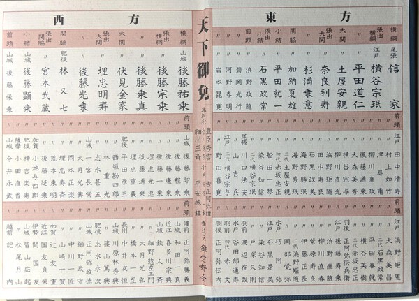
Frank, I've always been fascinated with trying to find a listing of what people called various styles/groups/etc of tosogu and what popular opinion was of each prior to Wakayama's (re)classification of everything to make for easier sales. Markus Sesko published an article a while back on a (probably late) Edo banzuke style ranking of tsuba makers -this is fascinating because it gives you insight into what was popular at that time: https://markussesko.com/2016/10/02/banzuke-%E7%95%AA%E4%BB%98/ Best, rkg (Richard George)
-
A lot of the owari "bins" have always seemed to me to be somewhat arbitrary, but maybe Ono would be what I would bin it as (or edo owari maybe). Best, rkg (Richard George)
-
Stephen, You kind of have to hold the piece in hand to really get it. On the image I sent - its a 360 image set - you "click and drag" right or left to rotate the piece - if you do so, you can see that the rope does what you describe - it goes to the edge on one side of the riceball (as it goes "behind" it), goes into/comes out of the center on the other side. The hard part about this stuff is study - a lot of the images in books are so-so, and while a picture may be worth 1000 words, I think getting to study examples in hand is often worth 1000 pictures. And study groups can be problematic - if everybody has the same poor quality and/or doctored pieces (rant omitted), what are you learning? And to a lesser extent, shows are the same way. I don't have a good answer for that. Best, rkg (Richard George)
-
Hey guys, I've actually been putting a lot of images of tsuba up on Rich Turner's Kodogu no sekai facebook page recently, but here's one you might find interesting - sorry about the link to the Facebook Collective, but they actually serve as a reasonable photo album, so....: https://www.facebook.com/pg/Kod%C3%B4gu-no-Sekai-%E5%B0%8F%E9%81%93%E5%85%B7%E3%81%AE%E4%B8%96%E7%95%8C-266005023454853/photos/?tab=album&album_id=2074031179318886&__xts__%5B0%5D=68.ARDQ4zLLe2GjNz0BYC0PPKQcUd24IejhE1kBszoD32425JcL5mQFLkaDIb3uI89oJ4T6Py6fh6vEAPVYY_gmB-Pplj2DisvhEGgRRL_cGpLO0gGVBKhPSRlLsfmnhn7DDsnbRCHqS7Ey9diAL_Km3dTjYoJGCPDkHeLXt6F-4idkZ_lG3VWrmzy---RJJBS26MqtlHywNgnZg1y6dEP0hFfsXeS2SQrzP0MB84VnKV48lTP6PykwWDtcpxEuDJ_0tBILsyjqSQPYidpWVOzPkjL_4t0VGpt6V3HIJy9vO-VJ2fJXcjLlXNlZDB9jVmzuY8IvxU3zy5IpuK02DUTucVQtSyOWo7rd-_12bKawckU1iQLWuYmnXBE1v4iT-K1yC9aZk17IKFNlDlyiEmNypTY6yklk_1M41u43SGGUoj2d8S5hUfV_VZS14UMR0ZItWJP2N5FsfSu0FhdgQlgz&__tn__=-UC-R And here's a couple of pics for those who absolutely won't go there... Enjoy, rkg (Richard George)


-
Steve, It might be in one of his books, but I hear it pretty every time we discuss Heianjo/Onin/etc work at study sessions at Haynes's place - its what Torigoye told him about these/what the Japanese thought (at the time he was studying with him) about them. I believe the seller was trying to hock the "eighty" character set on the front of the piece as Christian. Here's a collage of "probable good" Christian stuff from Japan (with the exception of the iris theme one - I don't really buy that, its here because somebody else called it a hidden Christian symbol - oh, and of course, the modern jesuit symbol): I'd have to look at the piece again under the microscope to see exactly where, but the image is along the edge of that big fat square inlay in the lower right hand corner on the back. As an aside, that lacquer is old (from its condition its -maybe- early edo though I think its a fair bit older than that - I recently ended up looking at/microphotographing a fair number of old tsuba to study the lacquer, but I digress). This is interesting because its a period repair rather than being some modern(ish) restoration... I bought it because it is a good study piece - in the final analysis, it comes down to personal taste - actually one of my favorite tsuba (and probably to prior owners as well as its been re-mounted a LOT) is this piece - and the inlays (circular rings on the riceballs, etc) are looong gone on it: http://www.rkgphotos.com/recent_stuff/riceball_front%281%29/riceball_front%281%29.html?fbclid=IwAR3fm7xYVKqzym98gCrHbOuK_aLzcVBpQxe4lcSb9_E76GPHpjfjQFpGNeM (sorry about not being able to find just an image again :-/) On your question - again,its always nebulous - the "rule" is that up to 10% losses are "acceptable", and they'd REALLY rather not see any major elements being gone (probably the only reason why Pete was able to get that one excellent tsuba he posted earlier...). The problem here is that often what is good is defined by what us gaijin DO NOT get to see :-/ Best, rkg (Richard George)
-
Pete, Great piece! The repairs are where the missing elements are filled with lacquer, right? I had a yoshiro piece with several lacquer fills for a while - I don't seem to have a still of the piece handy and I have to go, but its in this video starting at 3:05 Best, rkg (Richard George)
-
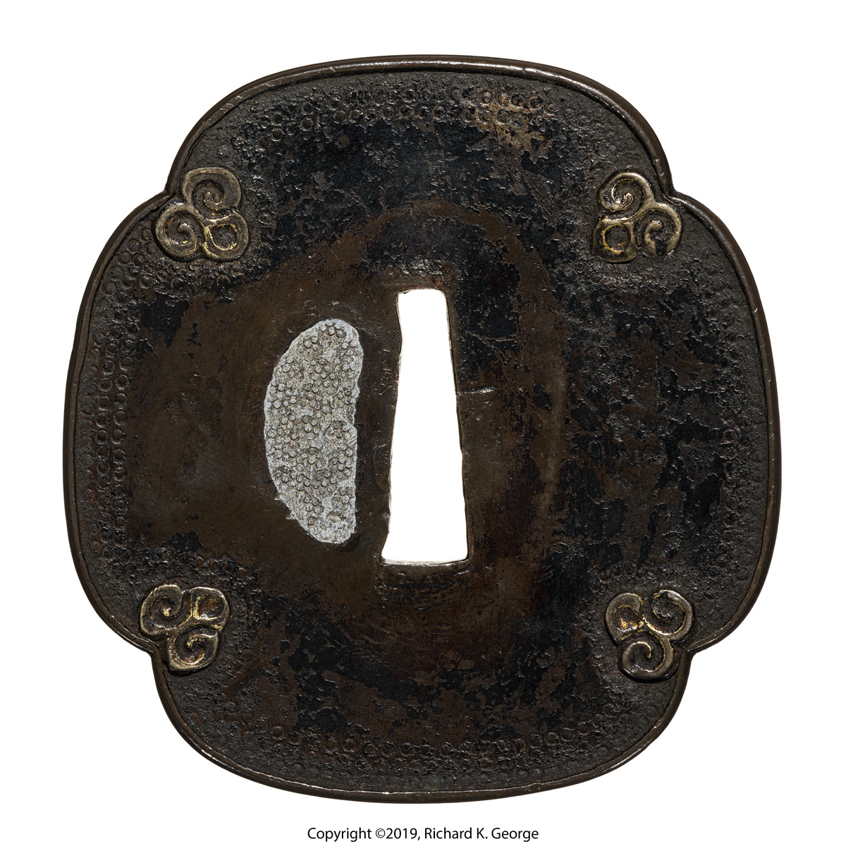
Stephen, The "classic" Japanese point of view (as stated by Torigoye, etc) is that a piece is still "acceptable" with up to 10% of the inlay missing (provided none of the pieces missing is a major design element). I've never figured out if that is a nod to practicality (early pieces with -all- their zogan are vanishingly rare (unless they've been er, repaired) and usually bring nutty prices) or it is a nod to the wabi aesthetic (I was lucky enough to get to photograph a juyo Onin tsuba that had losses that made me think about this for a while...). As I've posted here in the past about I think that this aesthetic was a "thing", as I've seen pieces that you -know- were not carried much that have not minor amounts of inlay missing as well as pieces that have been obviously well cared for (and used a lot) that are pushing/are possibly over the 10% number. I've also seen pieces where there is significant amounts of inlay missing that appear to have either been made without it or it was deliberately removed for aesthetic reasons. There are a couple of other possibilities - a lot of onin/heianjo tsuba have a unique surface that seems -very- prone to rust, so maybe it falls out quickly, maybe its easy to pull out if it catches on something, or it was done for some practical reason (the aforementioned basically unused heianjo tsuba was pretty grippy - it grabbed so many fibers on my glove that the tsuba would almost stick to it, so I could imagine somebody yanking the offending zogan to keep their clothing (or maybe even their hand when in use) from being shredded), On the other hand, sometimes they would repair the zogan back in the day. For example, I just got this square-ish heianjo zogan tsuba: Though it exceeds the 10% limit I thought it would be interesting to study - as an aside, this is a good example of people labeling stuff "christian" in an attempt to move product - the seller claimed this was "Christian" though the piece apparently predates first contact by the Jesuits by a century or so - But I digress... If you look on the back in the lower right corner, you can see some zogan that doesn't match - I believe this is ato bori as it is different in both design and execution (its the only place where lacquer appears on the tsuba - they sometimes used lacquer to adhere zogan - maybe they did do here, or they did it to "build up" areas of missing iron - here's a pic: While its valuable to know these rules of thumb, in the end I think it comes back to what you like personally.... Best, rkg (Richard George)

-
Here's one I have.... similarly shaped theme (chatsubo in this case, not sure what yours are), different effect, nunome (though its mostly gone), etc. Sorry about the youtube link I'm not sure where a still of it is squirreled away at the moment... Kyo shoami tsuba: http://www.militaria.co.za/nmb/topic/25328-kyo-shoami-tsuba/?fbclid=IwAR0WjhYv8Hx_6JROn1XAgynKvwHYMKQVEwpQkxOzifmNz42mXZ-CNd611bc http://www.rkgphotos.com/recent_stuff/new_kyo_shoami/kyo_shoami1.jpg http://www.rkgphotos.com/recent_stuff/new_kyo_shoami/kyo_shoami1_back.jpg I don't have one of the really ornate kyo ones with the nunome exactly like yours, but you get the idea... Best, rkg (Richard George) Best, rkg (Richard George)
-
I always think of kinai work as being more pictorial. Your tsuba kind of has a massive feeling like oh-no or maybe Myochin work, but i'm not sure you ever see nunome on them. Its a little massive for them, maybe its a "special" from one of the Shoami groups? - except for the massiveness, it kind of has a kyo-shoami feel - It seems to have had nunome all the way around the mimi/some on all the webs, right?). Best, rkg (Richard George)
-
Luca, thanks for passing that along (!) yeah, that's what I believe the piece kind of looked like originally, though the one above I think is actually more sophisticated visually, due to the maker introducing an "innie" and "outie" into the surface profile of the petals tto introduce visual motion as light would move across the piece (something the saotome guys did a lot of). Here's a snarfed image from the sale above for posterity - I do not own the copyright and it is being presented for educational purposes only: And the piece is interesting in its own right. The seem to be calling it umetada/ko-umetada, I guess due to the nunome on soft metal - but the sukashi seems poorly done for them (kind of off center here and there with wavy lines, etc) - I wonder if the sukashi are ato bori or something. Best, rkg (Richard George)